


A sustainable re-design of a local charity website
The old website of Refugee Action Kingston was built a long time ago, it didn’t conform to modern accessibility requirements and had little traffic. It was rarely updated because staff and volunteers didn’t feel confident about adding content.
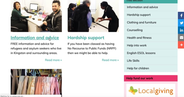
The aim of this project was to re-design the website in a sustainable way, so that it became easier to add content as well as being accessible and looking great.
Together with a redesign of the website, I created a style guide and system for adding new content.
To achieve this the following objectives were met:
+ Common industry format usability test of the old site
+ Research of two user groups Staff/ Volunteers + Clients
+ Research into accessibility standards
+ Task analysis
+ User journey mapping
A common industry format usability test uncovered a lot of issues with the information architecture of the website. Key information like opening hours, important contacts and services available were hard to find.
Based on interviews with people at the charity, two personas were developed for user groups who had the most diverse set of needs, Volunteers and Clients.
Story mapping was used to identify how the website could help people who are refugees during the time in takes to settle in the UK. Similar maps were produced for volunteers and people who want to make donations. This informed the updated content that was added to the site.
Performing an analysis of the different tasks that needed to be carried out on the website helped inform the design and function of the pages involved.
Object oriented UX proved to be an effective method in identifying the components needed within the website. A flow diagram of the components helped visualise how they linked to each other.
OOUX flow diagram.
The design of the website closely followed GDS design guidelines to ensure it was accessible to a wide range of people. Subsequent testing showed a marked improvement in the time it takes somebody to find information and learn how to use the site.