


In this project, a website was created with the aim of improving communication between people who are refugees and those who work to support them.
This part looks at the ideation and sketching of a solution.
Part one covers the user research that formed the basis of the design.
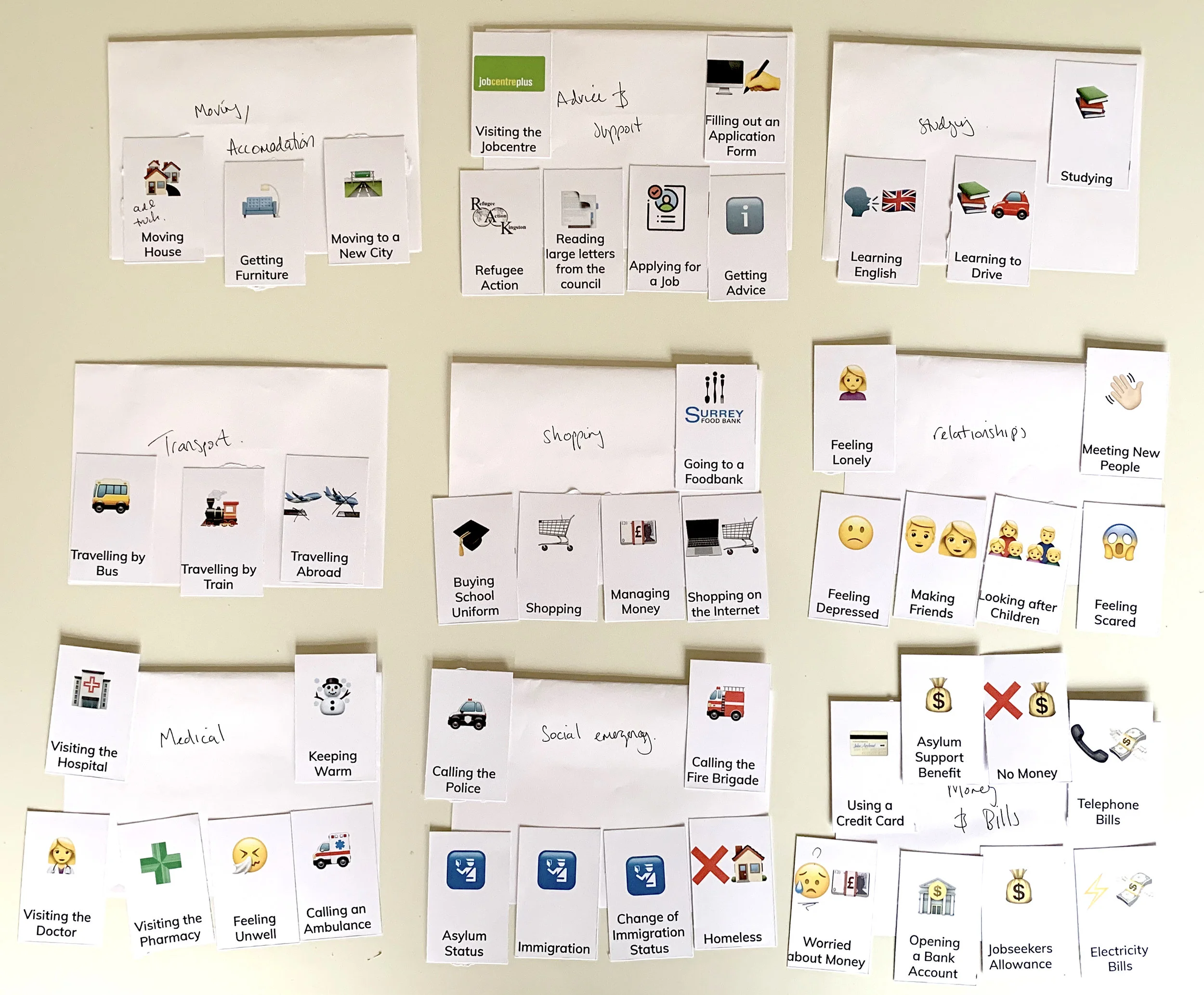
To ensure the website was accessible to clients, one participatory design session was conducted with two people who identified as refugees, one spoke Arabic as a first language and the other Farsi (Persian).
First, the participants were asked to read a passage of text written in different styles of Arabic fonts. Googles Noto Naskh style font was found to be legible by both participants mirroring the results of a previous study by Al-Wabil et al. (2006).
Second, participants were shown flashcards of emojis and asked to identify the meaning in the hope of using them on the website as icons. This short exercise revealed that while the meaning behind a single emoji was easily obtained, they cannot be joined together to make longer words or phrases.
With the essential components of the website identified, Object Oriented UX was used to define the make-up of the components and their relationship to one another. Voychehovski-Prater advocates this method on account of its ability to highlight contextual navigation or navigation through content at an early stage in the design process. By providing the ‘next-step’ when a user needs it rather than referring to persistent navigation, accessibility is improved.
To plan for which screens needed to be designed; findings from the OOUX exercise were aligned with the core structure of Wordpress and mapped out in a task analysis. This exercise highlighted the importance of error and result pages early in the design process, allowing for much better time management within each stage.
With the information acquired in the sketches a low-fidelity, clickable UI flow diagrams were created to visualise the user journey and identify any issues. Fonts deemed appropriate for use on the website were also implemented into the design to check legibility.
With an understanding of the fundamental requirements and flow of the website in place, sketches of possible solutions were made to visualise the object’s placement on the screen, scalability and possible navigation solutions. In the process of doing this, several possible design features to improve accessibility were identified:
• Colour to indicate the language of the page
• Large language selector buttons on the persistent sidebar.
• Sharing options on the persistent sidebar.
The process of creating digital stories had two aims with the first being to develop an easily understandable method for planning, writing and illustrating the pieces based on the plan described by Morra (2014).
Stories for the MVP were based on the issues participants described in the semi-structured interviews and created by the researcher in order to test the method for writing and illustrating the pieces. Initially, stories were planned using a storyboarding sheet before moving on to writing the script and illustrating each scene on a drawing sheet.
To test the method, two participants were recruited who had no previous experience of digital storytelling. The participants were asked to think about an issue they had faced in their daily life and then write down a plan for the story following the storyboard. Both participants managed this with relatively few questions or problems. The second phase of writing the script was more challenging for the participants with the researcher having to give more guidance in ordering and writing the story.
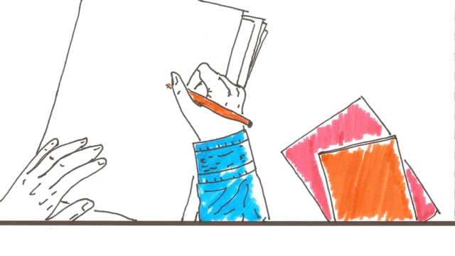
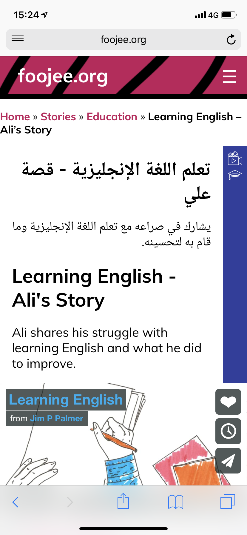
Here is an example story created using the method.
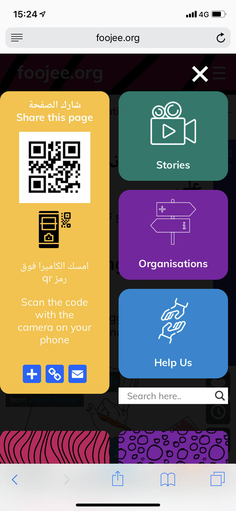
We’re putting the finishing touches to foojee.org so here are some screenshots of the latest version.
If you would like to find out more information and maybe get involved please drop me a message.